Volvo
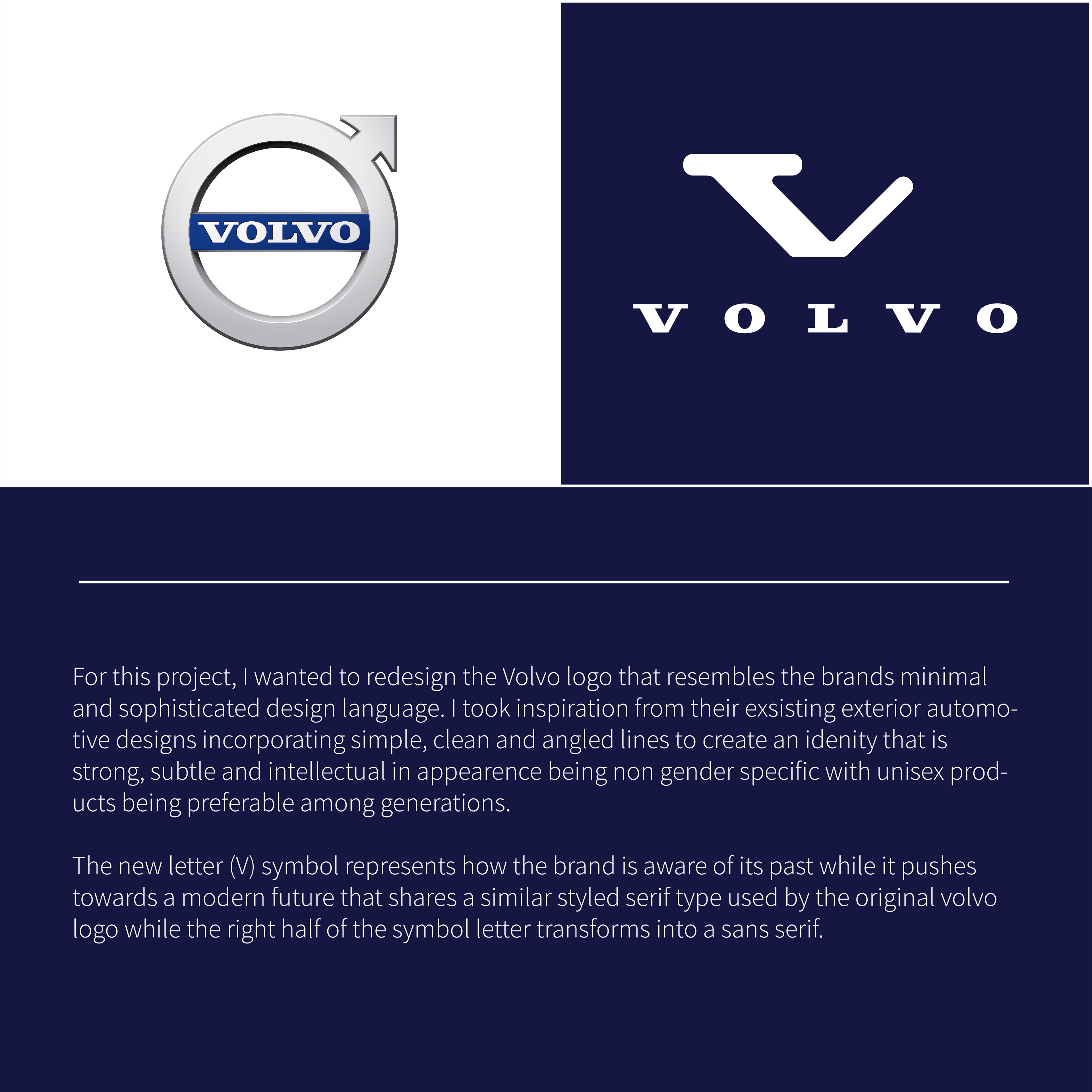
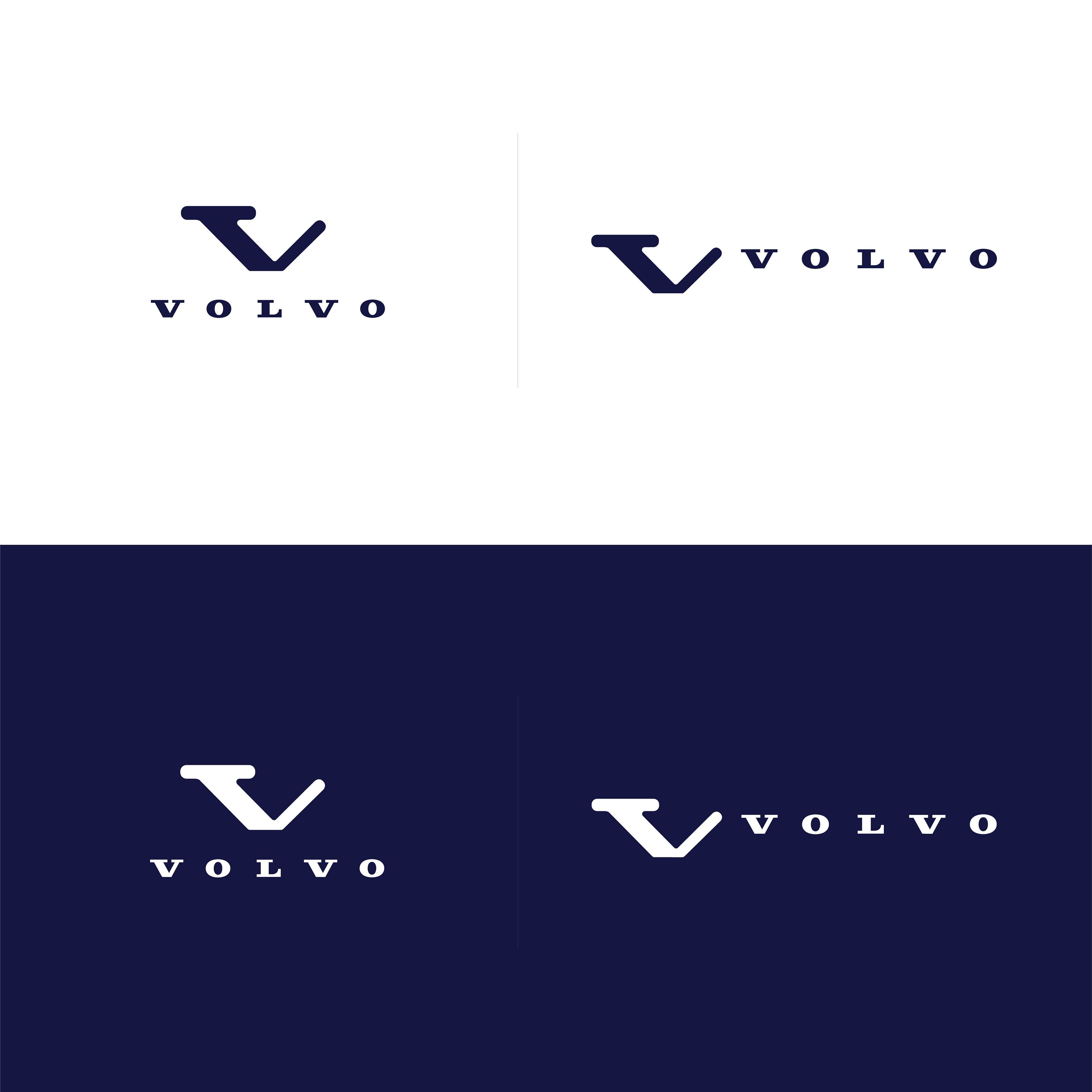
For this project, I wanted to redesign the Volvo identity that resembles the brands minimal and sophisticated design language. I took upon inspiration from their existing exterior automotive designs incorporating simple, clean and angled lines to create an identity that is strong subtle and intellectual in appearance, being non-gender specific with unisex products being preferable among generations.
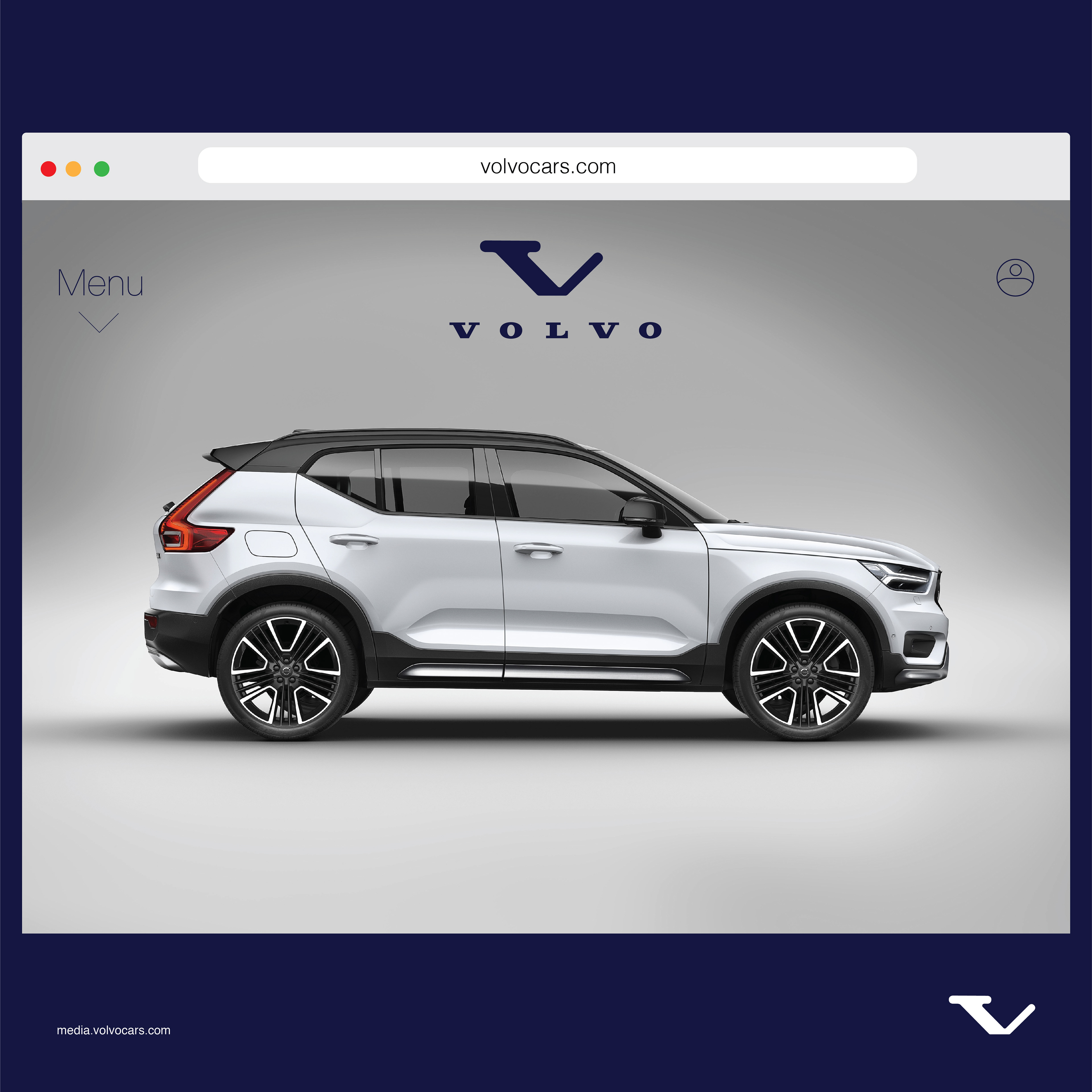
The new letter (V) symbol represents how the brand is aware of its past while it pushes towards a modern future that shares a similar style serif type used by the original Volvo identity while the right half of the symbol transforms into a sans-serif.